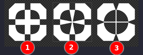
It's up to you 
The last one looks best to me, but the details in the center are getting blurred below 20px.
-
Don’t use less then 20 px

-
Make “+” bigger

-
Which one is the last one???
I hate this small pictures. 
Reminder: Never give the customer too much choice ![]()
I used to work in an advertising agency years ago. Usually I did one project that I liked, then I changed it a bit and made two more versions for the client to have a choice. The customer always chose the worst one.
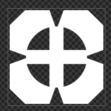
By "the last" I mean this one:


Seems Number 3, right?
You must know, my old eyes are bad ![]()
Number 3 looks great in big dimension, but the crosshair disappears when scaled down. I think number 2 is more universal.
Number 2 blurred too?
Number 2 in full white, 20px. Looks well enough to me. What do you think?
![]()
In this size for me are all the same ![]()
Try this ![]()

![]()
No, #2 is ok ![]()
24px:
![]()
16px:
![]()
I think it looks perfectly well.
@SGS, thank you very much for your creativity and patience. I'm not sure if graphics may be licensed as the code (MIT), or if it should be CC, or something else. Let me know.
Of course.
The 3D version would look great even on a wallpaper!
That is looking sweet. You better licence it, or other program developers will pilfer it for their own programs and not give any attribution.
Very pro looking.
I think something like CC BY 4.0 would be OK.
Can you GNU license a picture?
If you really wanted to, .svg format is nothing but XML.
The wallpapers that come with default Azote install are crap. If you don't mind, I'll add this one.

