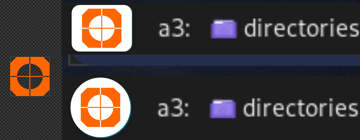
Taskbar is set to 16px (menu icon size).
Honestly: I think we don't need the "n" inside.
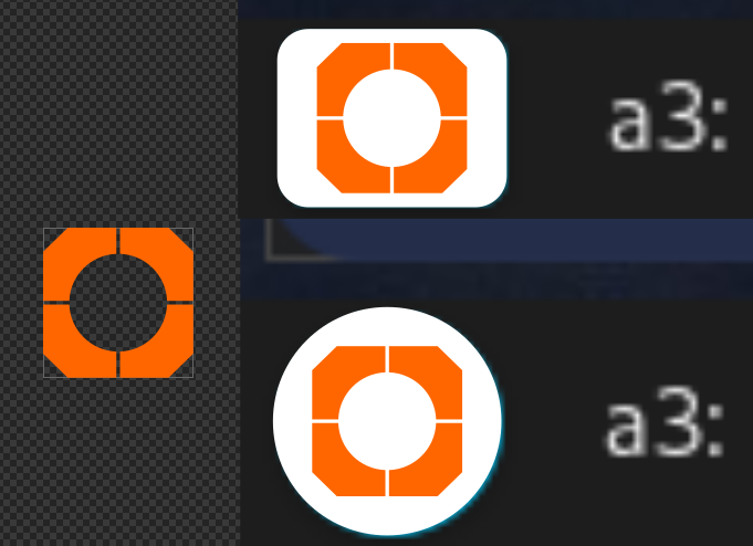
You can remove background circle or quader too, to make transparent icon, there are many options, also try other colors ![]()


1 Like
Grabs beers and pulls chair a little closer. 
3 Likes
If it were a commissioned work at a fixed price, I personally would not accept any subsequent change requests. 

1 Like
I need another minute to test in live environment...
What would you say about just 2 colors, one as the button background?
@SGS - sorry for being annoying. I want all the stuff to be as much customizable as possible. It's damned difficult to draw an icon that fits every possible theme...
Rome wasn’t built in a day either ![]()
Sounds familiar ![]()
In short, I need inspiration ![]()
Simple, sharp in 24x24px, not easy.
I have the greatest respect for the artists who create entire series for all conceivable programs even though they already have the corresponding “company logos” as a template.
It takes more time to create something completely new.
I wish I knew! My objective is a fully customizable shell for sway, including elements to choose from. Something like Zorin UI, which may resemble the OS you like. The logo does not have to resemble anything. It needs to be unique, simple and easy to use on the “Start” button.
For testing I left a variant of the nwg-panel logo…
…and will focus on the code. Graphic design should be done by a graphic designer.
' White! It serves as a beginning. White cloth may be dyed. The white page can be overwritten; and the white light can be broken.'
Felt the need for an idiotic non-contributory comment...(humour)
2 Likes
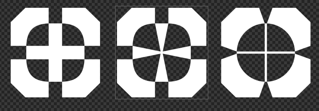
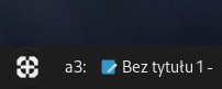
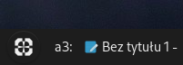
What about this?

Wait... ![]()
5 Likes
Too complicated
Test

3 Likes
Looks like it's upside down. 
1 Like
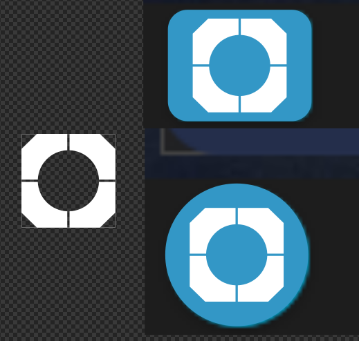
Yes, white is the only choice. Actually: monochrome, as people may use light background, so we need white and e.g. graphite version. I think that the gaps between elements should be a little bit broader in real life, or the'll be invisible.
2 Likes
![]()
![]()
![]()
4 Likes
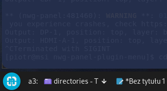
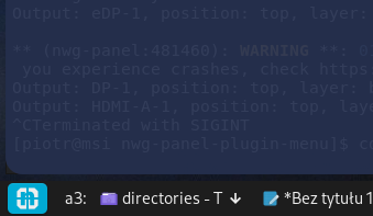
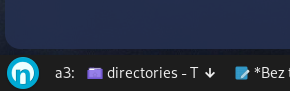
When I have an .svg file, I only need to place it in /usr/share/pixmaps to see what it looks like in the button.
It would be something like this (20px).
I colored it as #eeeeeeff and 444444ff, but just white and black could be considered, too.
1 Like
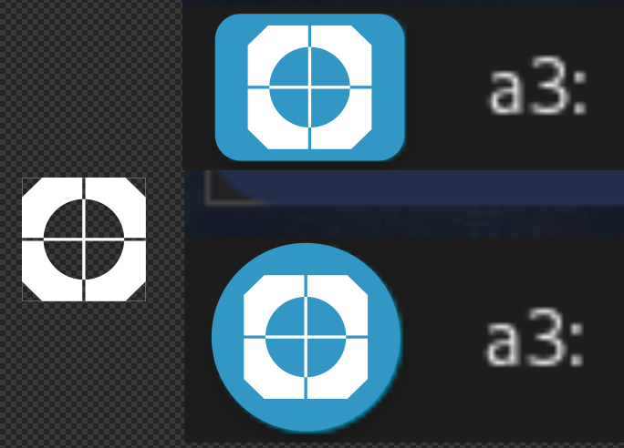
That looks perfect for your target audience. Get it, similarities to cross hairs on a scope.
3 Likes