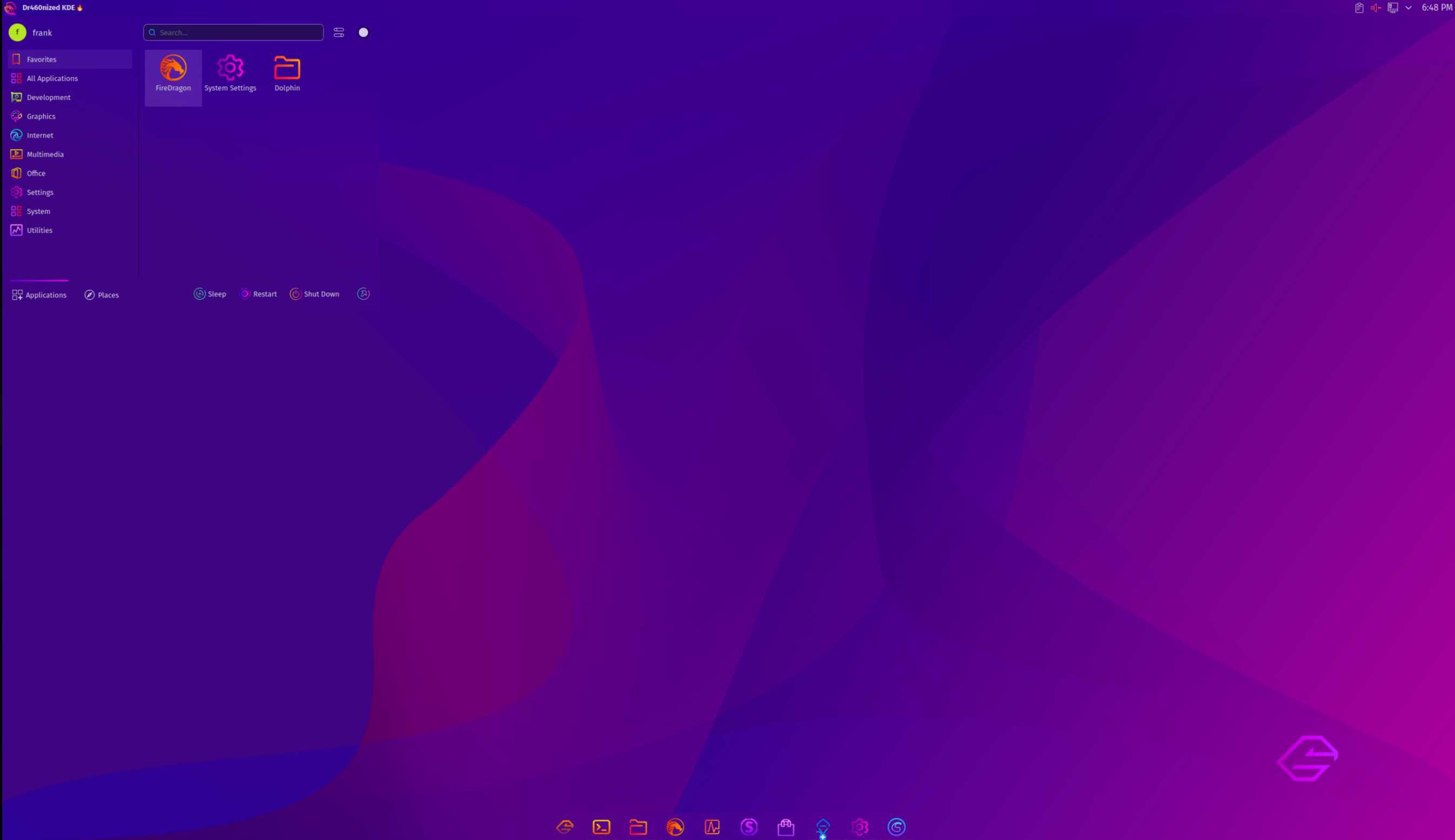
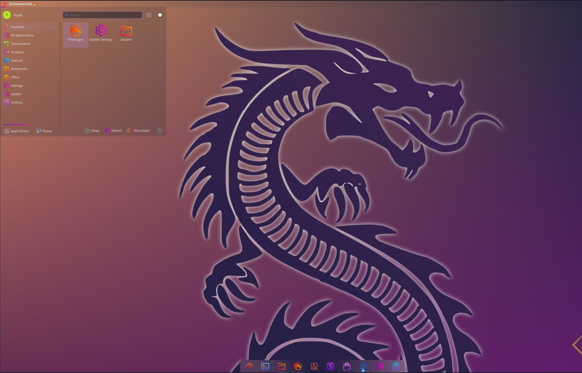
No one has yet commented but I would personally make the bar and dock slightly bigger. They were bigger with Latte, that’s mostly what I’m basing myself onto.
Missing Window Buttons widget is really annoying loll But we have to wait for them to fix, I know I know
I know I said that before, I find the panel backgrounds a little too dark. I think to have a better blending with Ghost and other wallpapers you could use 30% opacity in widgets/panel-background.svg and 40% opacity in dialogs/background.svgz.
I do believe for best blending with any wallpaper a 0% opacity in the above 2 files would work well. Since Blur is turned on for the backgrounds, whenever you change paper the backgrounds will follow its colors. Same for the Dialogs, although you can have those less opaque should you wish to distinguish a little the Dialogs from the rest.
Oh that’s an interesting one! It’s not even listed hidden in the Systray for me.
I just took your ISO and booted it of the same VBox you use. I did install the ISO and no USwitch as well.
I’ll take a look tonight (my tonight your night) if it shows with a “1” number besides the widget in the Widgets list when you click ADD WIDGETS. That’d be a start, not sure where else to look, oh maybe journalctl, in case it tries to set it on logon and fails there could be a log…
Not those from last night yet, they are a better modification of previous uploaded files. I will actualy try a couple %s and upload all test files, with screenshots here to compare so you can pick the opacity % you think look best.
I agree, that’s cuz I am stupid and took one of the most difficult wallpaper to work with to show the Dialog at 0%. loll But yes, having a slight opacity will blend with MUCH more papers, which is why I will provide a few % options for comparison, as mentioned just above.
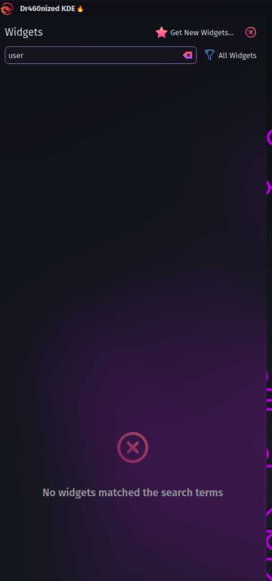
User Switcher widget:
Can't find anything in journalctl. Greped for "switcher", "user" and "widget".
I tried with and without VBox 3D acceleration.
Can anyone else boot the ISO and confirm?
It doesn't exist in in the widgets' list:
Oh you just migrated to Dracut.
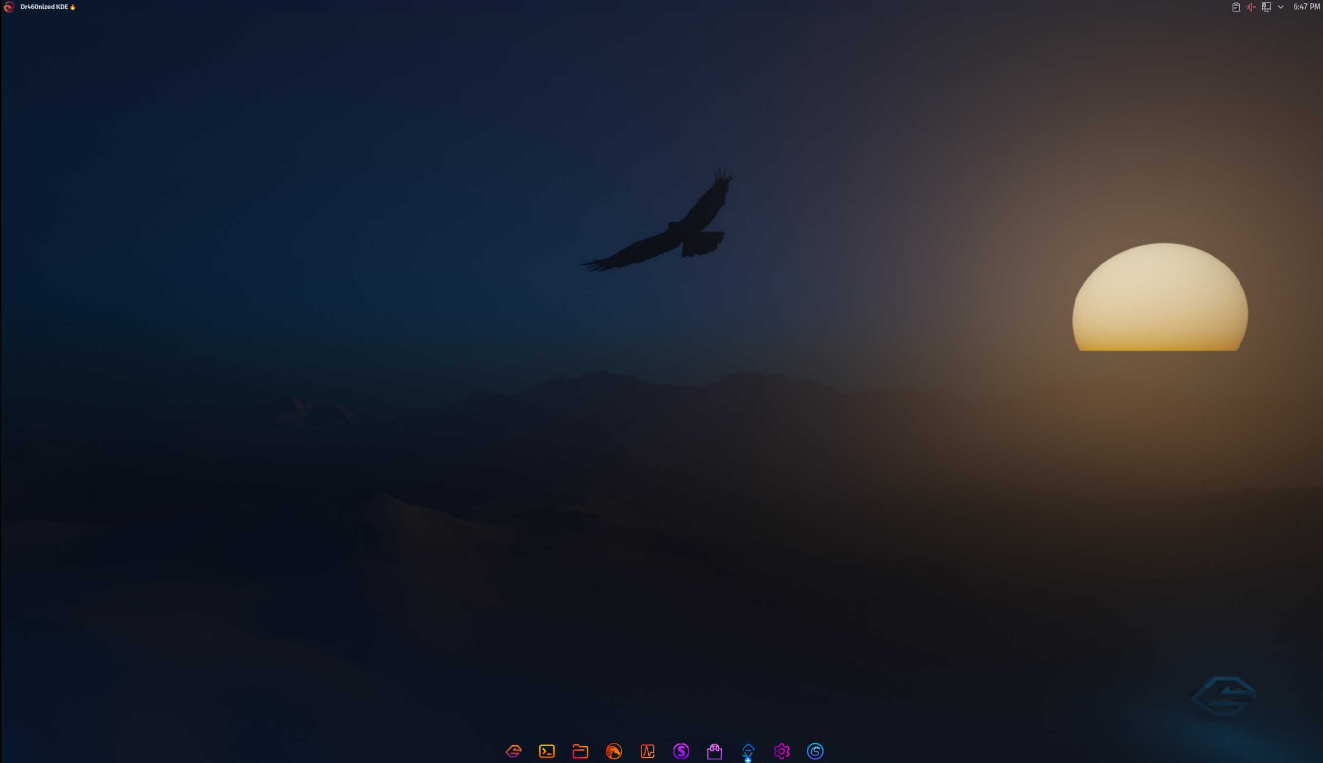
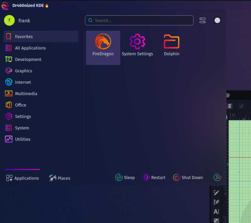
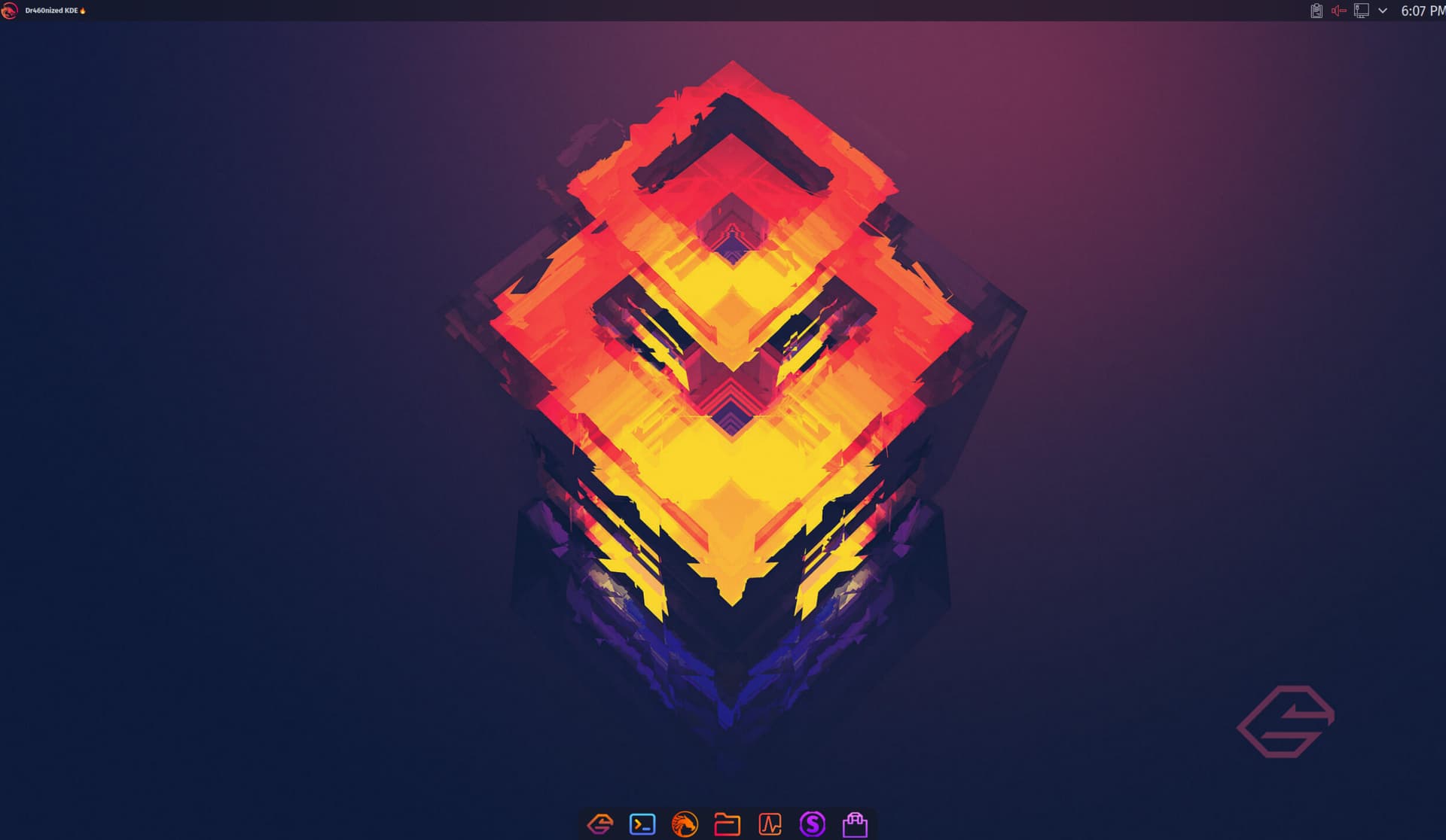
Oh it pushed your new Firedragon icon in the SDDM splash screen. VERY nice colors!!! I want that on my main machine right now.
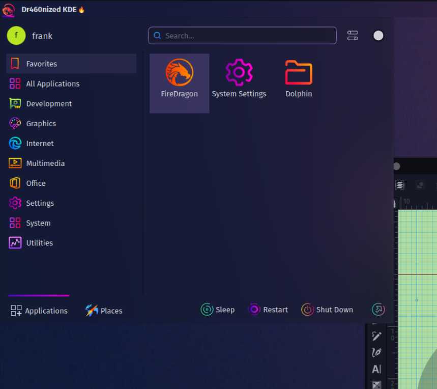
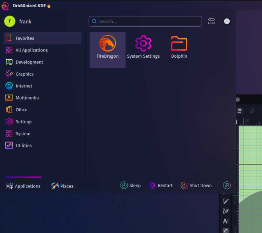
As for panel background colors, here are a couple of choices:
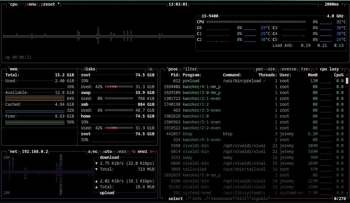
How are we feeling about having ksysguard as the default system monitor still? The "new" system monitor we have right now likes to include cache in ram usage and makes Garuda look a lot heavier.
Actually, you are right! There is no user switcher on the iso builds. Though there is on my production machine which is why it showed up for me wtf. Its like it never existed on KDE?
It does indeed contain the soon to be default already
You like it? I wasn’t very sure about how it looked in this context, but it’s good enough I guess
Yes, 30-40% is perfect! It makes the panel a lot more easy on the eyes IMO. I’ve added it as custom “Dr460nized” Plasma theme - thanks! There is a new test iso here
I’m not really a fan of Ksysguard. I would have suggested linking btop but it also shows cache it seems. Is this really an issue? Like we care about stupid reviewers
PHEW! For a day you made me think I was totally crazy.
That’s why I was very surprised in Post #38
I can’t find it also when trying to download the widget from Plasma integrated download feature.
Whoogling and githubing for the widget same thing, can’t find any reference. Only USwitcher which isn’t the same and crashed when I installed it. It’s as if User Switcher has become a ghost…
Oh yeah it really stands out! It doesn’t stay there very long though lolll, I have to retest it again tonight.
That’s also my opinion, I understand the extremes is not what you’re looking for, for many good reasons, so when I saw how 30-40% looked I was pretty sure it would be a great blend. I can try many other variants to that but in the end the changes will be too subtle I believe. Although if I think I come up with something significantly better later on I’ll let you know.
“Total” and “Used” are the featured values in the memory window, and “Used” is not counting cache–which I believe is in line with what TNE was suggesting would provide better optics.
Users who understand what cached memory is and would like to see the whole picture can just read the rest of the chart, so everybody wins.
My own personal opinion is that if we're highlighting KDE as the distro's main DE, we should also try as much as possible to utilize the mainstream KDE apps, (unless there is a distinct deficiency with the KDE version).
I must say I personally prefer ksysguard a lot more, it's a mature app that is quite "Windows like", for better or for worse, but it's not my decision to make
It’s not in the 221210 ISO, correct?
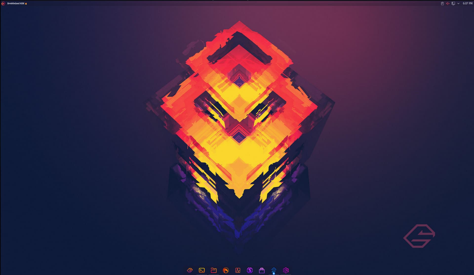
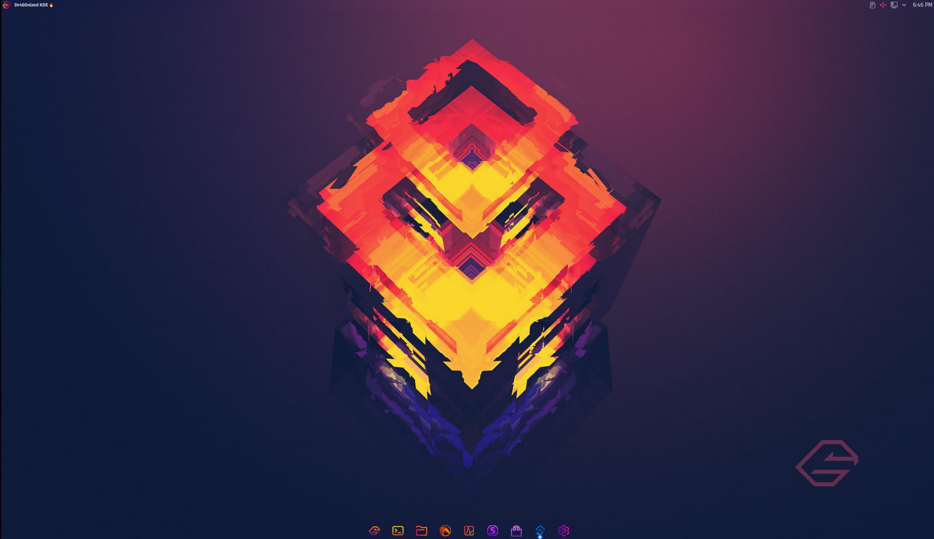
Sizes are the same as 221208.
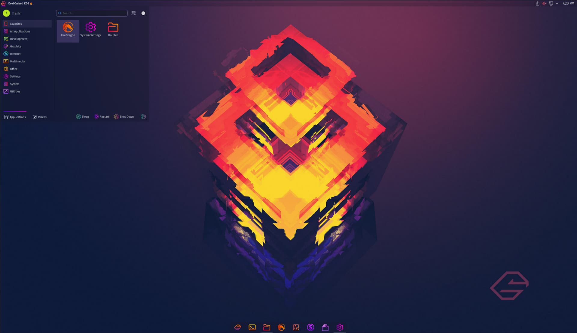
I was thinking something more like 60px on the Dock and 39 on the Top Bar. Again looks more like how it is in the ISOs with Latte. But I think you will find 60px too big and that’s where the unfortunate Plasma-way-of-doing-things limits us, as soon as you increase the Dock from 50px to 52px, you will see a big step up in icon size.
1st shot is your ISO, 2nd shot is with 39px and 60px.
Dragon, I don't know if you found something for UserSwitcher, but I found out in the ABOUT page of the widget there is the author's name and email. He's from Germany so that's pretty cool.
Maybe contacting that guy if he responds might yield somewhere?
Just throwing out the idea.