Excuse the long title cough. Also, I noticed I can’t post in the FAQ and Tuts category. If I’m breaking a rule by posting this, I apologize.
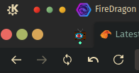
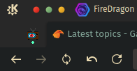
Was messing around today with some userChrome.css styling, and figured out a way to hide the window buttons when maximized, to fit the mac-esque styling of dragonized. Thought I’d share it, in case anyone else is bothered by the doubled set when using the Window Buttons widget.
- Navigate to about:profiles
- Click Open Directory in the Root directory of your profile
- Open chrome/userChrome.css in your editor of choice
In here, you’ll see @-moz-document, and are asked to style inside this scope. The styling we’ll be adding is
:root[sizemode="maximized"] .titlebar-buttonbox-container {
	display: none;
}
Just in case you need it, here’s what the finished complete code should look like in a blank userChrome.css file.
@charset "UTF-8";
@-moz-document url(chrome://browser/content/browser.xhtml)
{
	/* Please write your custom CSS under this line*/

	/* hide window buttons when maximized */
	:root[sizemode="maximized"] .titlebar-buttonbox-container {
		display: none;
	}
}
Now just save it, and restart FireDragon.
Before:

After:

Edit: after googling the selector, I found I’m about 4 years late on the topic ![]() . So here’s an animated version
. So here’s an animated version
:root[sizemode="maximized"] .titlebar-buttonbox-container {
	max-width: 0px;
}
.titlebar-buttonbox-container {
	transition: max-width 0.3s linear 0s;
	max-width: 100px;
	width: fit-content;
	overflow: hidden;
}