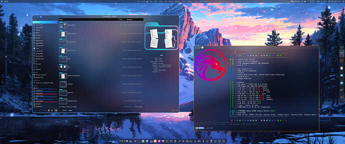
if i read your comment correctly to go from Dr460nzied pink to blue you just need svg,s
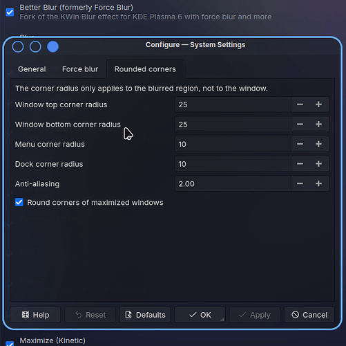
I’m using this big times for a while. It is not perfect, it could be related to which theme or how you customize it, but I am a DEAD fan of rounded corners so it’s always on my radar to find a way to integrate. ![]()
Examples of “not perfect”:
Famous KDE bug of the phantom triangle in the corner
![]()
Sometimes the line almost disappears:
![]()
Plasma requires SVGs and Color Scheme (new Icon set as well obviously but those exist, expect for Garuda’s custom icons).
Firedragon requires SVG (PNG maybe) and Firefox Color theme.
so artwork is easy then.
Implementation and consensus is hard ![]()
Yeah pretty much that.
That doesn’t mean we are not working on something, though, so yes @ullr your suggestions are heard and we’ll see what can be done with time.
I think maybe looking at lavender sea dark as a base might be nice as well it has a good neutral color scheme. I at least always find myself using it as a base. I have made my own title bar theme and blurred the kvantum theme a bit more. Can also use the sweet amber blue kvantum theme. But I feel it passes for those that want blue. whats nice is it has a gtk theme so gtk apps mesh well.
I haven’t gotten to it yet but Ive been looking into making it react with the plasma accent colors.
The problem with rounded corners and forced blur for that matter will break every qt update. An the user would have to go in an modify the the colors an levels of each if they change the theme down the line. I feel that would only give SGS more work of people not including the inxi. Mainly bring questions that should more be directed at the features maintainer.
A kinda bad example since its not the default Garuda layout.
But yeah just my 2 cents as a garuda fan.
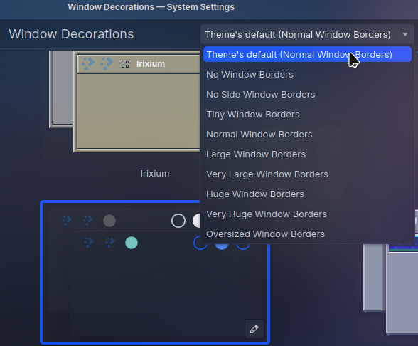
@FGD You can address that with forced blur(now Better Blur) and in window decorations tweak the borders. Some themes are weird about this.
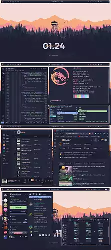
Did not know there was so many people that liked catppuccin here hahaha, here is a old rice of mine:
2 - Sorry, dont think you understood my second point. There are a number of ways to add a virtual desktop on kde, and I know my way around, thats not the suggestion tho, the suggestion is a visual indicator widget, similar to my rice above.
4 - I know that, but in my experience users who are not powerusers are quite fearful of touching anything kernel related after installation, so a ready to go option from the get go could prove to be a interesting solution to this demographic.
Users who are not power users should not be asked during installation which kernel should be installed. They are already busy enough with the existing options in calamares. ![]()
As written
The initial user experience during install needs to be on a kernel that has been tested…switching to an untested kernel increases the chances for a new user to not be able to get to the desktop on first boot.
I believe this is the same reason all the updates are done post install, presumably after a snapshot has been taken so they could back out of them if they cause problems.
One thing that always should be taken into consideration is that adding extra themes and kernels to install ISO’s considerably increases the size of the ISO.
When reading statements about Garuda on the web (especially Reddit), one of the most negative comments always thrown out there is how bloated Garuda is. These types of statements are patently rediculous, as Garuda offers the “Lite” edition for those looking for a frugal install, as well as other minimalist DE’s and WM’s. Unfortunately, the minimalist editions are always totally ignored in these oft repeated slanderous statements from Garuda bashers. Anyone with an ax to grind against Garuda always labels Garuda as “bloated”, as if it’s some huge failing of our distro.
If the ISO size becomes further increased because of these types of additions, the Garuda haters will be sure to scream from every rooftop how disgustingly bloated Garuda is. Haters will be haters, but no need to unnecessarily give them further ammunition to try and libel our distro. After all, these features being requested can easily be added by the user post install.
One other thing to always keep in mind, is many people in the world still do not have access to fast internet. Keeping ISO sizes down benefits disadvantaged internet users who want to install and test Garuda. Not everyone on the planet is blessed with lightening fast internet speeds and unlimited bandwidth.
I themed FireDragon with an Opera GX Theme.
I think it looks nice and simple.

Is it possible to add an option to the live .iso’s installer to let the user choose from a small list of themes?
Personally, I would like to see themes being implemented in the Garuda Welcome app somewhere. I think this would be a good option to allow people to choose the theme they like the best without increasing the size of the ISO. I agree that the ISO size can be a significant issue to those without access to fast internet. While I don’t view it as a large download, this isn’t the case everywhere.
I think it would be cool to have some kind of theme switcher, and allow users to submit their designs to be featured in the Garuda app. I know this is most certainly a ton of work to accomplish something like this and I have no idea how to actually implement it, but just sounds like a cool idea to me. While I am using and enjoying the Dr460nized theme, I would also like to experiment with other looks and it seems like people on the forum have a lot of cool looking setups.
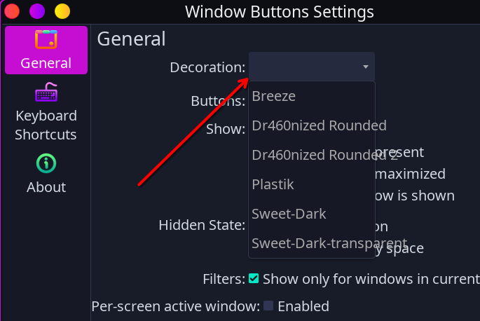
I tried a theme called “Infinity-Dark” that just came out on kde-look. It integrates well with garuda and I continued to use the beautyline icons. The problem I ran into was although I preferred the Infinity-Dark windows decorations they did not show up when an app was maximized so I was forced to go back to sweet’s three colored dots…is there something that has to happen to make this work with firedragon so dots show up?
2 posts were split to a new topic: Suggestion for the system update script
Dear Garuda Linux Team,
I wanted to take a moment to express my heartfelt appreciation for the remarkable experience I’ve had with Garuda Linux. Having used several Linux distributions in the past, I took a break from Linux and returned only recently. To my surprise, I found that many distros today are more functional and beautiful than ever before. My current setup is on a Dell Vostro 3470, and I’m happy to report that everything works flawlessly out of the box—even hardware like the inbuilt monitor speakers, which I had struggled to configure on Windows.
In my exploration of the various distros, I encountered Garuda Linux, and I must say, I was absolutely astonished by it. The aesthetics of Garuda, particularly with KDE Plasma 6, are unparalleled. It immediately captured my attention, and I am now completely enamored with it. While other Linux distributions are certainly beautiful, Garuda stands out as something truly unique. The design is not only visually striking, but also incredibly pleasing to use. The dragon-themed wallpapers are a perfect complement to the overall theme, adding to the distinctiveness of the experience.
I am genuinely impressed by the work that has gone into Garuda Linux. It feels like an entirely fresh and exciting approach to the Linux desktop. It is clear that a lot of passion and effort has been put into making this distro special. I believe that once someone experiences Garuda, they will find it difficult to return to their previous operating system, whether it’s another Linux distribution or Windows. Garuda deserves much more recognition, and I truly hope it gains the popularity it deserves.
That being said, I do have one small suggestion. While I understand the importance of showing the GRUB menu during boot, I feel that the text-based messages that follow could be replaced with the beautiful splash screen right from the start. Displaying text messages during boot feels a bit outdated compared to other modern operating systems like Windows and major Linux distros. I believe this would enhance the overall experience and make Garuda even more visually stunning from boot to login. I’m confident that implementing this change wouldn’t be too difficult for the amazing Garuda development team.
Once again, thank you to everyone behind Garuda Linux for creating such an outstanding and unique operating system. Your work is truly appreciated.
Kind regards,
Lal
Add quiet quiet to kernel parameters, use garuda-boot-options and set boot time to 0.
If you ever have a boot problem, you’ll wish you hadn’t set it to 0. ![]()
Dear Sir,
I would like to clarify that I did not request the removal of the boot option. My intention is simply to remove the two lines of messages that appear after selecting the boot option, specifically:
"Loading Linux linux-zen..."
"Loading initial ramdisk..."
I understand the importance of the GRUB boot option for troubleshooting and do not wish to alter that functionality.
Thank you for your valuable time and assistance.
Best regards,
Lal
