![]()
8 Likes
I’m sure this is a point of contention any chance these to settings could be changed on the next build. If not I do understand.
“This includes all kde garuda editions”
First, the “Clicking on files and folders” while i understand it from a efficiency prospective. It’s quite alien to any user coming from not kde. Before they changed it in Plasma 6 to default to “Selects them”.
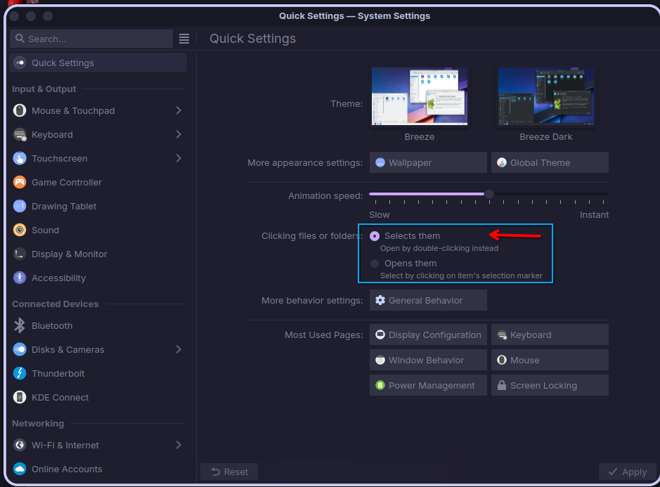
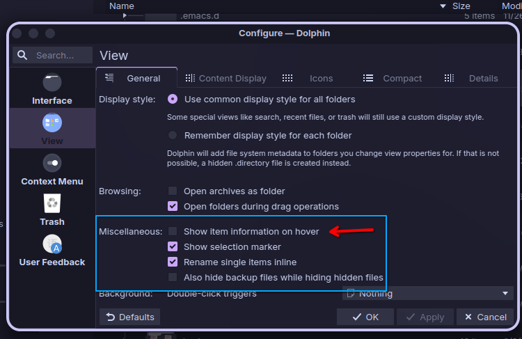
Second, This one since you can hit F11 to get info view and the fact that the hovering is quite large an cover up most of the items under it. Its quite jarring. And if you are new to kde its quite a hard setting to find to change.
Again I do understand if these cant be changed but just a prospective.
2 Likes
I flashed both Hyprland and Dr460nized using Popsicle. Installed both on a Spare Desktop and a Laptop, both installed, updated and ran with common software choices.
4 Likes
A post was split to a new topic: Dragonized Gaming fine for audio production?
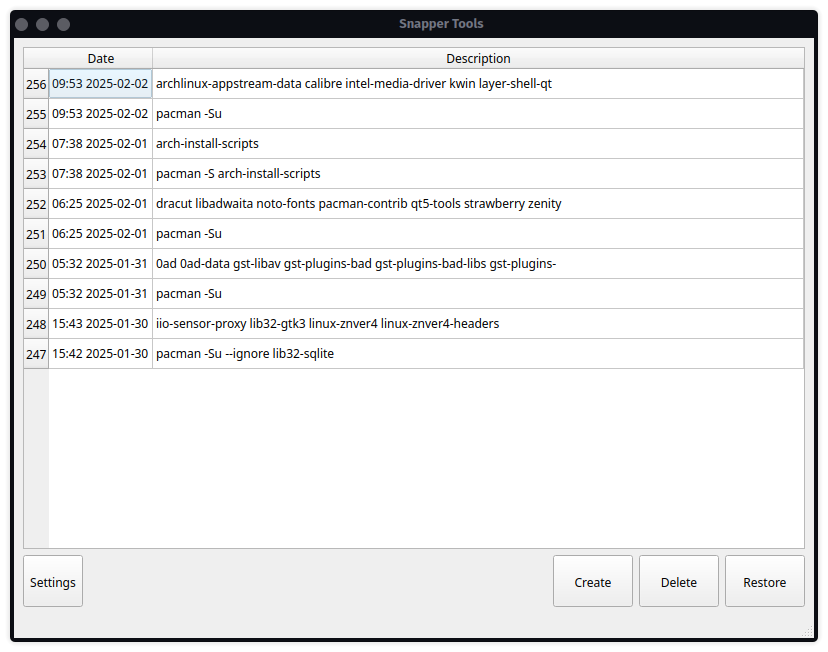
Just an observation that ‘Snapper Tools’ opens a light themed window. This is in both the current and new release. Regular dark Dragonized theme is running.
2 Likes
I was trying to check the above Snapper thing on Sway edition.
It doesn’t launch for me, can anyone running latest sway testing ISO confirm??
Also as from what I can remember, Snapper always opens in Light mode…
Not much is not alien in Dr460nized and Mokka for someone coming from not KDE. If they land here, it’s cuz they want a change.
The Single-Click to open files/folders fits our goals, which are different than Windows and Plasma.
Changing this setting for the reason you mention would imply also changing other settings and UI for the same reason, like removing the Top Panel and reworking the bottom Dock.
I don’t think a lot of people know that, but…
…that is a good point. I will remove it.
Yes, been like that for a long time, cuz it is launched with elevated privileges.
5 Likes
On the showing info on hover it’s my hope with Plasma 6.3 that it’s restored it to what it was previously as far as size, cause I’m sure I’m not the only one that’s noticed that it now can get in the way of trying to click your item where it wasn’t a issue in the past.
EDIT:
Speaking of Plasma 6.3 it’s due to be released on the 11th of this month. On top of that there should be a nVidia driver update coming out any day now.
1 Like
Looks much better!!
2 Likes
I noticed the mouse scroll wheel is the same (current vs new) inside a terminal window, but inside FireFox the new build is much faster than the current one. It’s easier to shoot past what I’m aiming for (like drifting). This totally subjective description may be due to too much caffeine.
Talking about Sway,
This might be my OCD kicking in but…
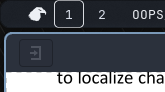
The gap before the Garuda logo is a bit too much
compared to the other side
It’s not a big issue but noticeable.
One last thing, I understand if it can’t happen.
In garuda assistant pamac is still there. I know garuda used it back in the early days. But now with its off and on issues. Would it be possible to remove it.
When users see it there, they think its garuda approved. But it always leads to trouble in the long run. An adds people asking about it on the forum here when issues happen. Which is always leads to the user being told its not recommended. An to use paru or pacman, and if need be octopi to search.
This is nothing more then what I’ve noticed so I understand if it can’t be changed.
3 Likes
Yikes! That looks bad. I assume that is the new Qt 6 version of the Welcome app, is that right? We may have to take another look at that Kvantum config.
What is your method for launching it? If Fuzzel, try nwg-drawer and see if it’s any different.
![]() I will take a look and see about setting the two margins to be equal. Now that I look at it, the icon in that power button ought to be centered as well.
I will take a look and see about setting the two margins to be equal. Now that I look at it, the icon in that power button ought to be centered as well. ![]()
2 Likes
Where in that page?
1 Like
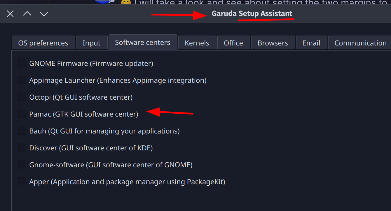
Yes my mistake, setup assistant. I should have caught that sooner.
edit: If Pacseek was given a .desktop file that just opened it in like konsole it would be perfect.
2 Likes
I guess it is perfect then. ![]() https://github.com/moson-mo/pacseek/blob/main/assets/pacseek.desktop
https://github.com/moson-mo/pacseek/blob/main/assets/pacseek.desktop
5 Likes
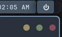
It turns out the gap is the same, just the fact that there is no border on the icon makes the padding look like a bigger gap than the other side. Kind of an optical illusion I guess.
If you add a border to it you can see what I mean:
![]()
The icon also does not appear centered (some icons just behave this way).
I can drop the padding on the left-hand side of the icon like this:
![]()
Then when I remove the border, the gap between the icon and the end of the Waybar is more in line with the power button on the other end.

I added a smidge of padding on the right-hand side of the power icon as well, to get it centered in the button.
What do you think? Looks better?
Hmm, it seems this application needs a few things to be set in the environment to run. If I launch it with sudo or /usr/lib/garuda/pkexec-gui snapper-tools it does launch:

Seems to be empty in my case–not sure if that is the app not working correctly, or just that this is a pretty oddly configured rig I am testing on.
It does launch with the correct theme though. ![]()
2 Likes