IIRC comfortaa 
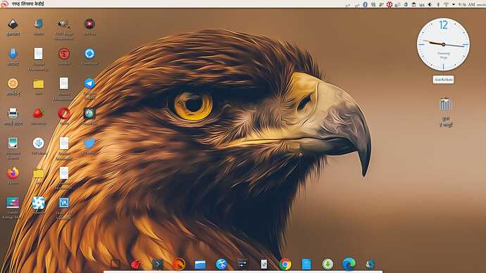
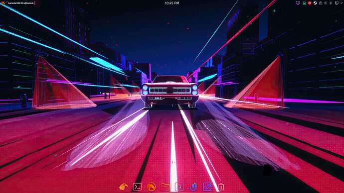
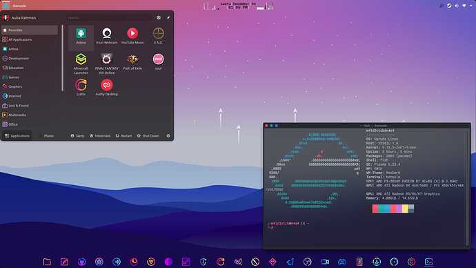
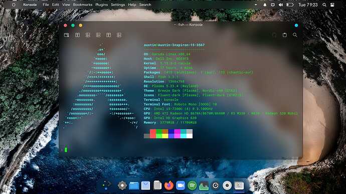
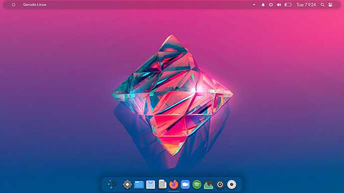
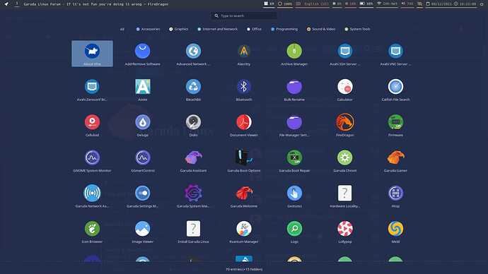
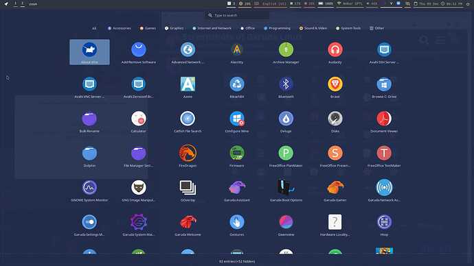
Still got some work to do (namely changing the font in the less convenient places), but finally close enough to being sharable:
I didn't stray very far from the way it came I mostly got rid of a few widgets at the top, replaced a few (the left-hand corner is not the app launcher anymore it is corner menu) put the clock in the middle(I like it there from using gnome), got rid of the network monitor and user account widgets(redundant since corner menu has this) the Garuda logo at the bottom is my app dashboard now. Obviously, the wallpaper is different, but that's about it. What can I say, I like the theme and general layout of Garuda Dr460nized
It's been a long time since my last post on forum when work is starting to piling up from the middle of this year until now and there's still lot to do.
I hope you all stay healthy and happy ![]()
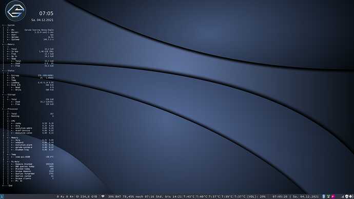
Why two displays for volume and network?
???
Why two displays?
For volume and network?
Yes 
Once reception strength for the network and once volume of the speakers
Is the bar (I don't know the proper name off the top of my head) not interactive, thus the need for system tray?
E2A, @SGS
Isn't the system tray redundant for these two?
No, ![]() I would like to see the values also in numerical form, not only if it is active and to get to the settings.
I would like to see the values also in numerical form, not only if it is active and to get to the settings.
So, the bar isn't interactive.
That was my query. I thought/expected most of the system tray functionality to be available in the bar widget.
I'm with you on preferring precise numbers rather than "somewhere between 20-40% or 40-60%".
If I change the Volume on keyboard it follow in bar, so only the right icons are interactive, from BT to the right, the left ones not ![]()
![]()
OT over and out ![]()
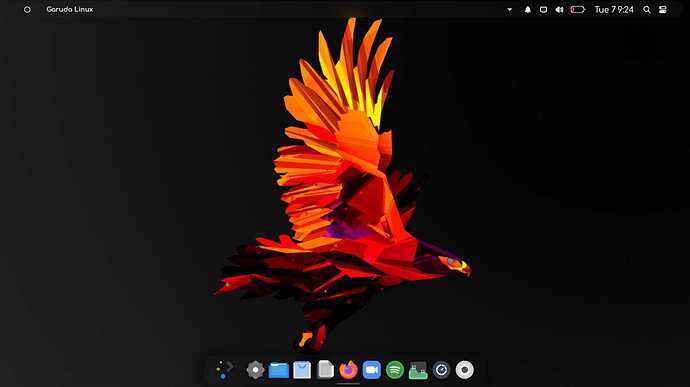
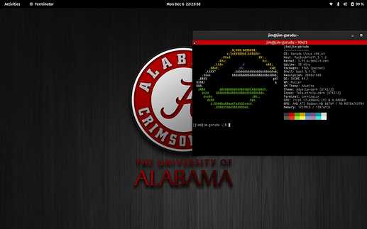
Wow, the latest release of Garuda Gnome looks fantastic. IMO, the collaboration of the default shell color with the darker wallpaper and icon set creates a nice visual synergy. A more mature desktop relative to the brighter, youthful appearance of the flagship.

I am posting this so you can see my Gnome install. I am testing Linux on My Mid 2015 MacBook Pro so that I can eventually replace macOS when Apple EOF's my Laptop.
2 posts were merged into an existing topic: A Gorgeous KDE Plasma setup
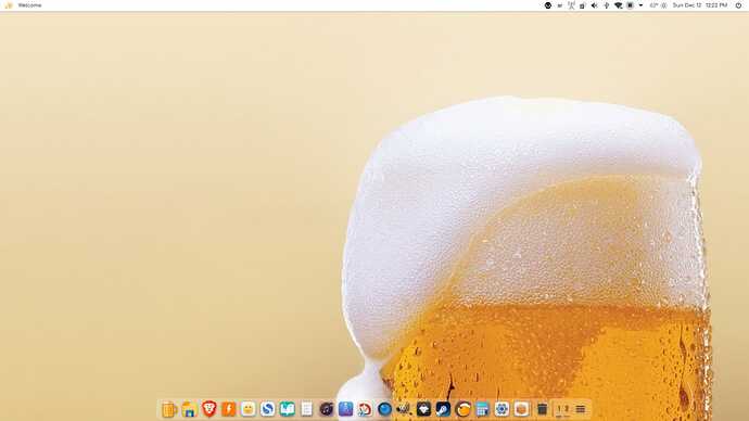
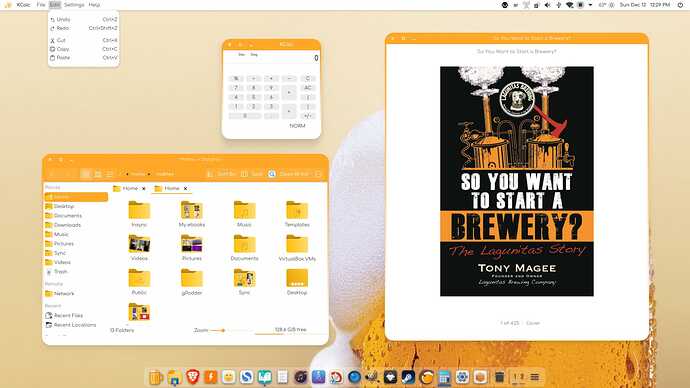
“It came without ribbons, it came without tags. It came without packages, boxes, or bags.” Beer! ![]()
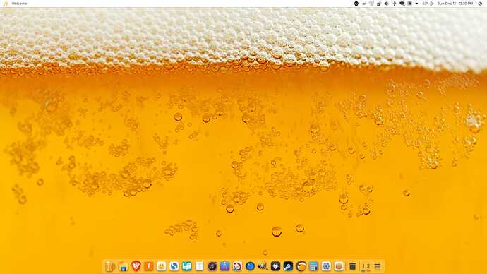
Alternate Wallpaper...
Application Style: Kvantum Nova Leo theme
GTK/Gnome: Flat-Remix GTK Yellow
Plasma Style: Nova Color (Leo)
Colors: Nova Leo
Window Decorations: Nova Leo
Icons: Win10Sur
Cursors: Bibata Tinted
![]()

