New Update on Dr460nized suddenly adds padding to the KDE Panel bar

Hey guys,

I have been updating last night and this morning, I noticed additional panel padding which I had turned off when it configured it to be off when still using KDE 5. It reduces the size of my icons in the panel which were fine tuned to be well visible while stealing as few screen space as necessary.

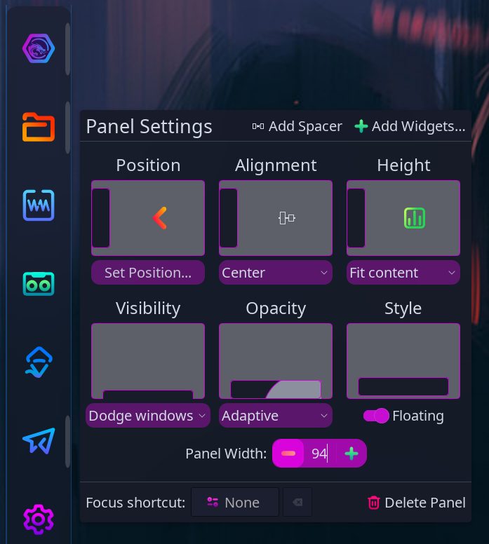
See the difference using images.

When I am turning on the old Sweet theme again, I have my prefered panel without additional padding:

Screenshot_20240326_123724

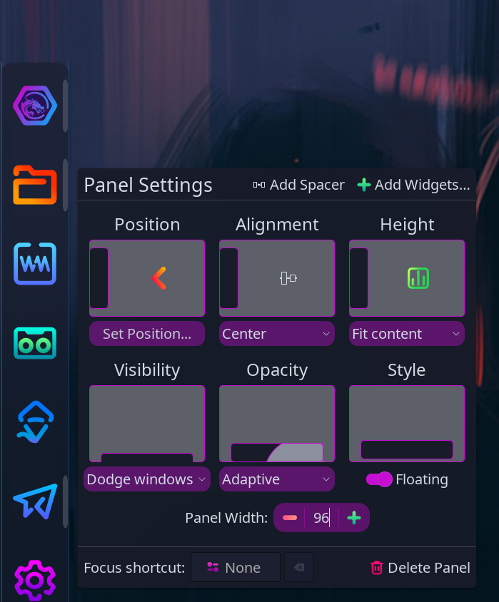
When I use the current Dr460gonized theme(s), it looks like this (Dr460gonized Candy):

Screenshot_20240326_123813

Once, there was an option to enable/disable the padding but I could not find it no longer (removed in KDE 6??).

I also experience other defects resulting from the breaking change to KDE 6.

  • This morning, the really useful display text over the weather applet is gone without having changed anything (I use the German Weather Service whereas wetter.com does not work well).
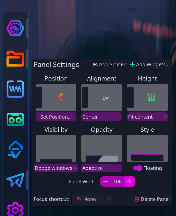
  • Since KDE 6, the display text over the icons in the KDE panel has become too small to read from a normal screen distance, 6 pixels (out of 36 pixels) where it was like 10 to 11 pixels previously.

Screenshot_20240326_124303
(It currently looks like this.)

I did not find any option to change this display behaviour. I don’t know, where to report it since the text over icon issue is the same for every Plasma Style. Seems like I am getting no answer in the KDE forums.

Cheers

From the looks of it you are using Icons-Only Taskmanager? If so rightclick a empty spot on your panel, select configure icons-only taskmanager, and in the bottom box on the appearance tab chose small and see how that looks.

Completely right, I am using the Icons-only Task Manager. In the past (and before I posted) I did exactly what you recommended to try. It doesn’t bring back the icon size that I want to have. I need to enlarge the Panel size from 36 to 38 pixels so that the padding is not steeling space from the icons. However, I don’t like the new padding and so I am using the old Sweet Plasma Style now.

Ah, btw, the weather icon now shows the overlay text with the number of degrees again. Seems to be a hickup.

Yea no fan of the added padding. Somewhere on the KDE forums I asked about making that adjustible. I doubt I notice it as much as you do cause I have my top panel at 96 so I can have 3 rows of icons in the systray.

As far as I remember, it was adjustable with KDE 5 (at least I remember, I could add and remove it with an option) but after the update few weeks ago, I haven’t seen the option anymore.

That’s on purpose.
And that requires a good explanation. :smile:

First of all, the Dr460nized Candy theme is quite different and requires padding (called “margins”). Without it the icon indicators will render partly under the icons, which made this alternative theme unusable. Besides there were no padding between the icons which made them way too close from one another and the look was not good.

Based on your screenshot, the padding makes that particular theme looks as intended, although it could possibly be better looking on higher resolution screens.

As for the Dr460nized Plasma Style (not the Candy one), you don’t have a screenshot of that one. But I noticed an inconsistency between my tests results and the actual end result in the latest testing ISO. There is something in KDE scaling my results and not re-applying the theme properly, size-wise, from one test to another. This drives me crazy so today I have reduced slightly those margins which were too big in the Dr460nized theme, package version 4.2.3. V4.2.4 will help.

Due to these test results inconsistencies, I have to hit and miss until I figure the right margins through the daily ISO builds (in Plasma 5 it was better looking, I’m trying to reproduce that). Sucks for now, I am trying to figure out how to make these tests consistent with what will actually show in the ISO.

On another note, the way Plasma Panels work make it fundamentally inconsistent between various screen resolutions, scaling and DPI. Depending on your resolution, scaling and DPI, the panel size and icon size vary. On top of that, Plasma Panel does not scale linearly, at some point it makes a huge change in icon size and it throws off everything.

Here’s an example:

94pts (way too many margins)

96pts (huge change but good margins on that theme)

106pts (10 more but still almost same size)

It’s very hard to find a good balance.

EDIT: Based on your screenshot, it seems to be one of your TOP left screen corner, which means you are also including IOTM in the Top Panel. This is not how Garuda designed it, we have a Top Panel and Bottom Dock, in which the IOTM is located. The bottom Dock has a bit more height than the Top Panel, so if you move IOTM to the Top Panel, it will shrink icons and margins will take more space which will shrink icons even more.

4 Likes

Thank you very much for your work. Indeed I think, the Candy theme looks better than the Sweet one. It is just the icon size for me, that is because of discrete scaling steps as you mentioned.

For a complete view, this is how the normal Dr460gonized looks like:
Screenshot_20240328_155439

The advantage is, it is much better visible which application is opened at the moment.

What screen resolution are you using? It seems smaller than 1920x1080.

This topic was automatically closed 2 days after the last reply. New replies are no longer allowed.