New logo, new typeface?

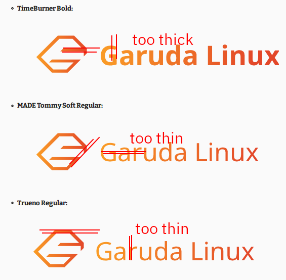
We've seen the distro's new neofetch logo, but what about a nice new typeface used with it as well? I had some time to spare and wanted to practice my Inkscape skills, so I tried practicing a mockup of how the new logo would look as the official project logo, with all of the fonts used being 100% free for commercial use, in order not to bring any issues or costs to the project if any of them were to be used.

I decided to go with Sans Serif fonts to bring a less "gamer-y" and kinda tacky and more professional face for the distro, but the more ideas and examples the better.

  • TimeBurner Bold:

  • MADE Tommy Soft Regular:

  • Trueno Regular:

7 Likes

All a matter of taste :slight_smile: , I like this one :smiley:

Summary

g8805

6 Likes

Nice. Might be interesting to match the line width between the logo and the text?

3 Likes

I don't know which one of us or what you mean by that.
If you mean me, this is not an end product, I have used his measurements that he posted in the svg for comparison.


Deepl cant translate this correct :slight_smile:

Ich weiĂź nicht, wen von uns beiden oder was du damit meinst.
Falls du mich meinst, das ist kein Endprodukt, ich habe mich zum Vergleich an seine MaĂźe gehalten, die er in den svg gepostet hat.

OMG, better he send png , I see other things here in browser
because I do not have this font on my computer

OMG, better he send png , I see other things here in browser
because I do not have this font on my computer
[/quote]

I just realized that SVG files on browser can render fonts weirdly, I'll change the files for .png ones for better visibility.

2 Likes

Sorry, I meant like this:

Not specifically matching letter parts to logo parts, just general overall line widths.

I don't actually know what it would look like, but it would be interesting to see.

Edit: OK, the PNG images look completely different... :sweat_smile:

Of the three typefaces, I like the third one overall, but the G needs the "kick" back towards the middle (whatever that bit is called).

(The first one, TimeBurner Bold, is too similar to Comfortaa which is used by a certain other distro.)

4 Likes

Oh, it makes sense. I just used fonts that I thought fused well with the logo to create an example, didn't take too much time to play around with them, but it's actually a good idea to do so.

1 Like

It all looks kind of boring, monotonous, no tension. Dynamic is created by differences.

Sample

Different fonts, thickness and so on.

4 Likes

Gave it a little V1.1 using Trueno, with a more "pointy" G to better match the sharp angles of the logo, tighter kerning, and matched the thickness of the logo with the thickness of the font.

3 Likes

And of course we must use the new - new logo :wink:

g6064

5 Likes

Oh crap, I didn't realize I was using the wrong one, I'm looking into the feedback and will try another typeface to match it

2 Likes

I can't help but this difference is what makes it so attractive.
So don't invest too much time in it.

I like the old writing. :slight_smile:

3 Likes

I was making a simple font weight change version like this…

…and accidentally created the “I use Arch Garuda btw” version

I make these in around 5-10min, it’s just a fun side project :grinning:

7 Likes

That’s amazing. :joy:

3 Likes

Here is the PROhACKER version usr_share_icons_hicolor_scalable_apps_garuda

original by @SGS

3 Likes

I really like the color/tones of that version. However, I do think whenever you modidify one of @SGS creations you should always give him credit for the original.

I do like that modified version though.

4 Likes

Mental note: install raven theme manajer

Why does it have a diffrent font on other computers?