And no, I'm not talking about the font, which I have very strong opinions about.
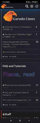
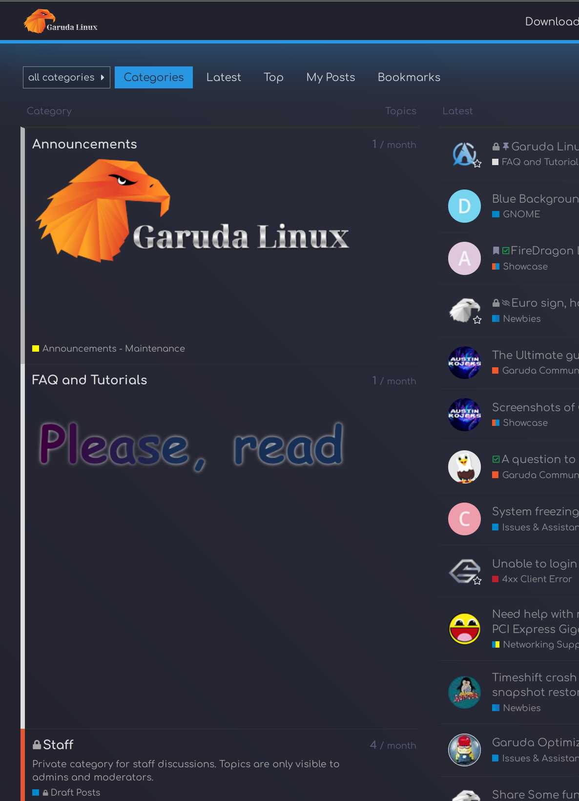
It looks fine on mobile, but on desktop there is a big gap between the FAQ and Tutorials section to the Garuda Community section. It throws the grid off.
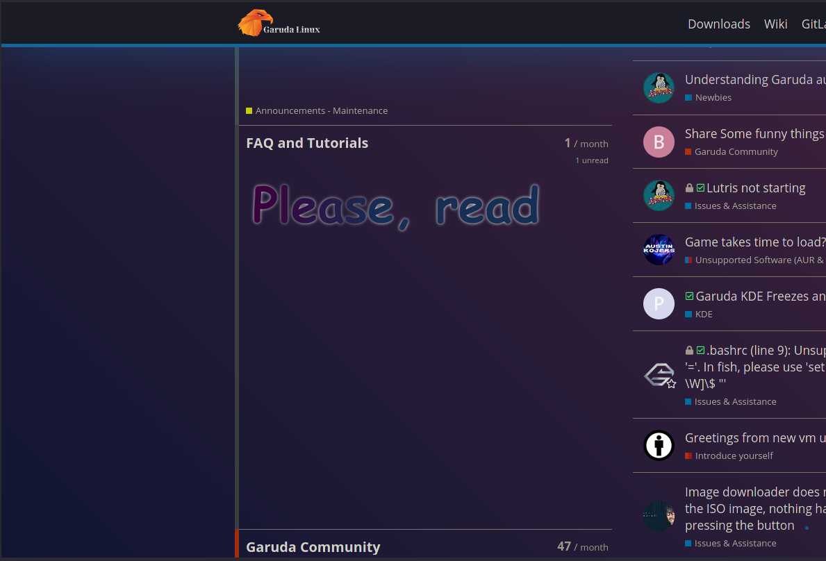
Both PNG has the same size
but take up different amounts of space (height).
Of course, there is nothing about the requirements where they can be inserted into discourse.
The same goes for background images, which are not displayed for me.
In the discourse forum, I only read briefly that it consumes too many resources anyway, because it is constantly reloaded.
Nevertheless, I’ll leave it as it is for now to search for a solution, the kiddies are all just hanging around with their smartphones here in the forum anyway
If you remove the category description it will resize correctly.
"Get the latest news about package updates and what is important about Garuda Linux."
Or go into the category-list.scss and unhide overflow if you have access.
Edit: you done it