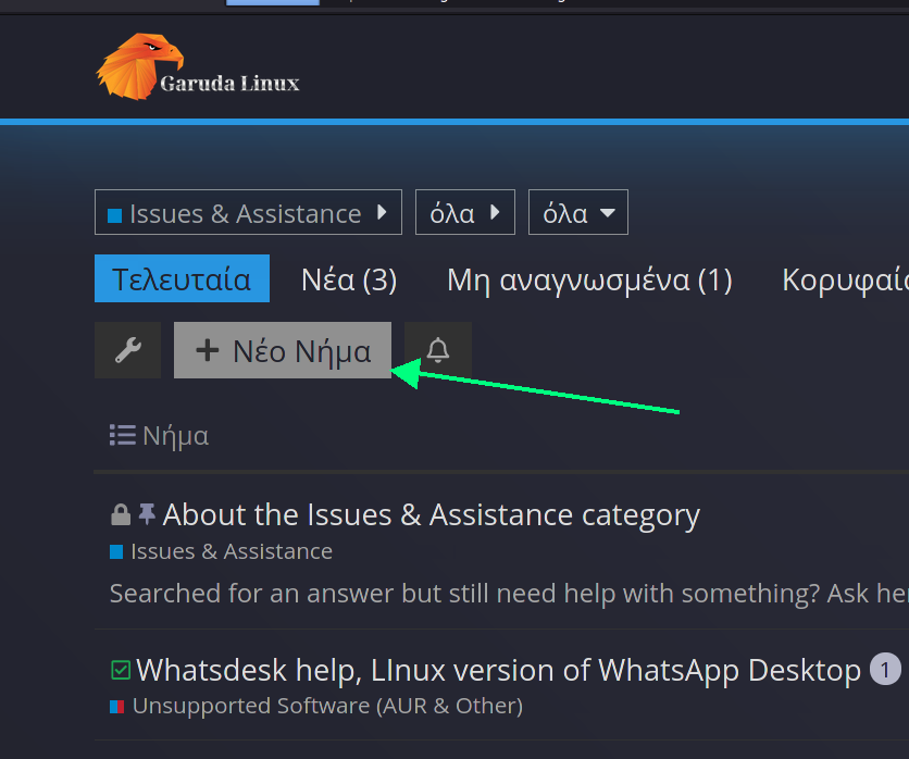
I noticed the "Catagories" button is black text in blueish box (that's cool), however, the "+New Topic" button is white text in a greyish box. It doesn't really stand out very well. Just my opinion, but I honestly believe it should stand out more.
We were contemplating hiding the button completely, but instead we decided to simply redirect the link to the Garuda Wiki. 
8 Likes
It is a matter of theme setting, I think.
Maybe @Naman would find some free time and replace class btn-default with btn-primary at categories page for the button id="create-topic".
I don’t know how many pages would need this edit… ![]()
We also have to ask the Garuda Design Section. They are really tough when it comes to changes… ![]() @SGS
@SGS
3 Likes
Can you post a screenshot? I can't understand what do you mean

1 Like
Exactly that!!! Come on man, this is Garuda Linux Country!!! We don't use bland "grey out" boxes like those sub-standard Garuda Linux wanna-bees. Dragoniz3 that box !!! 
1 Like
See if you like it.
1 Like
What if it puts someone's eye out. 
2 Likes
Well they shouldn't be running through the house now should they...
1 Like
This topic was automatically closed 14 days after the last reply. New replies are no longer allowed.