Attached is a picture, bottom is Firefox and top is Chromium.
Not sure what causes it, I haven't changed any settings, this is from a default installation.
Attached is a picture, bottom is Firefox and top is Chromium.
Not sure what causes it, I haven't changed any settings, this is from a default installation.
I don't see any difference at all from a Windows machine, but it gets me wondering if you are using the same fonts, or whether one of your browsers is substituting for a missing font?
I didn't notice any difference either, but I figured that was because of my lousy vision. Glad it's not just me.
Same here.
And my glasses were on!
How did you install firefox? Is it a repo package or are you using a snap/flatpak?
FWIW, I can see the difference, even in that low res image.
I used the default installation that the garuda helper asks you which software do you want to install (if you could please let me know if that is called a repo package or snap/flatpak I'd appreciate it).
There is a difference guys, look closely. I was doing some research on my own and I found out that each web browser has its own text engine, HOWEVER, since I also dual boot Windows, on Firefox it looks just fine.
I can't tell you whether it's a Linux issue or the Garuda Distro itself. I tried installing the google-fonts package yesterday and that did not fix the issue either.
I had not installed any fonts BEFORE I encountered the issue. I then installed the google-fonts because I read that youtube uses the roboto font (which was installed anyway) and even after installing the font package the issue persists.
Please, set the same fonts and the same size in both Firefox and Chromium. It's easy to do. IMO, it's not worth you pursuing otherwise.
What can happen--and what we don't know--is that sometimes browsers will substitute a similar font, if the exact one called is missing. And scaling a font up or down can also alter the visual aspects, so please set them at the same size. And tell us so.
In addition different browsers will yield different visual aspects from each other, even if they're built on the same engine. And the same goes with different operating systems. Fords don't look like Chevys, or even another Ford, but they all have wheels and motate.
Heck, it wassn't all that long ago I guess it was 8-9-10 years ago--I forget--that achieving good font rendering in Arch was a son of a bitch. I'm so grateful for the difference.

I will try and mark as a solution if it achieves the same results.
I doubt it will as Firefox has an option that says 'Allow pages to choose their own fonts, instead of your selections above' which implies that no matter what you set, the website will choose the font.
Thank you.
That can be the “substitution” part of it. It would be nice if websites all rendered standardized the same.
Did you also install ‘ttf-ms-fonts’ package? That can sometimes help a little.
No, I did not, I will do so as soon as I get a chance to hop back to my computer.
Issue persists, fonts still look odd on Firefox.
I guess I'll have to deal with it then.
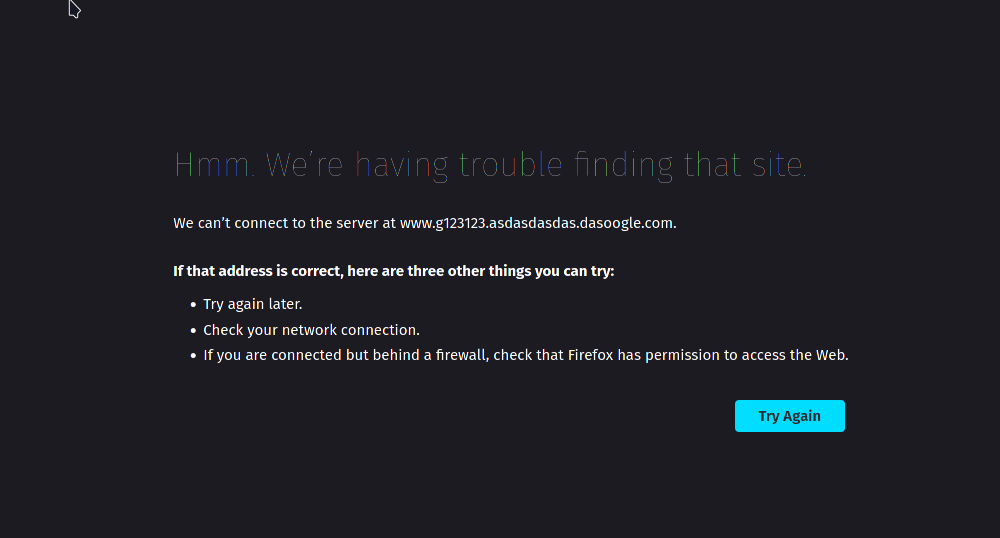
When you get a 404 error do you get this screen? The error screen is different, the font has so many colors as you can clearly see.
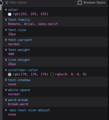
Computed font also looks correct.
I tested with KUbuntu for another KDE Environment and Pop!_OS for Gnome and the issue persist.
Just posting so if anybody reads this in the future knows what not to try.
"Everything we hear is an opinion, not a fact. Everything we see is a perspective, not the truth."
~not Marcus Aurelius
Don't believe everything you see or read on the internet.
Abraham Lincoln 
This might be the last bump/reply from myself. I think I figured out what the issue is.
So when I zoomed in in the webbrowser, the fonts look better, I couldn't figure out why at that point.
Then it got me thinking about my display, I have an ultrawide display (3440 x 1440) and I'm sure the issue is the PPI or something related to it.
I will try again with 4K TV and report my results.
Potential issue, no solution found:

Top is Chromium, bottom is Firefox.
I went to the developer/inspect element mode and changed the font from 10px to 11,12,13 and 14 px to compare.
I don't see a difference at 12px (not sure if you can still see it from the images). Also I noticed that the whites and darks of both webbrowsers were slightly different.
So by increasing the font size most of it was gone, not sure if it is still there or if it's some kind of placebo effect.
This might have also something to do with my current ultrawide resolution and something I found is called subpixel rendering, but I'm not savvy enough to say with certainty.
This topic was automatically closed 14 days after the last reply. New replies are no longer allowed.